G.C
Address: 1 Shelford Road
Project name: The Shelford Condominium

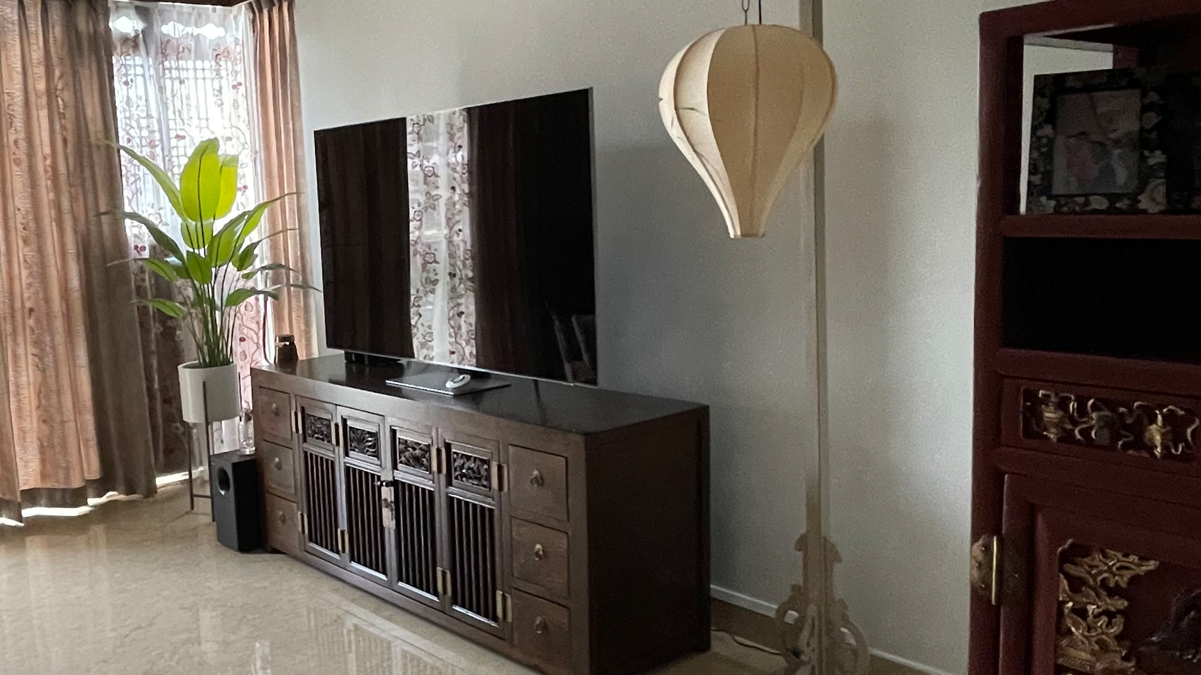
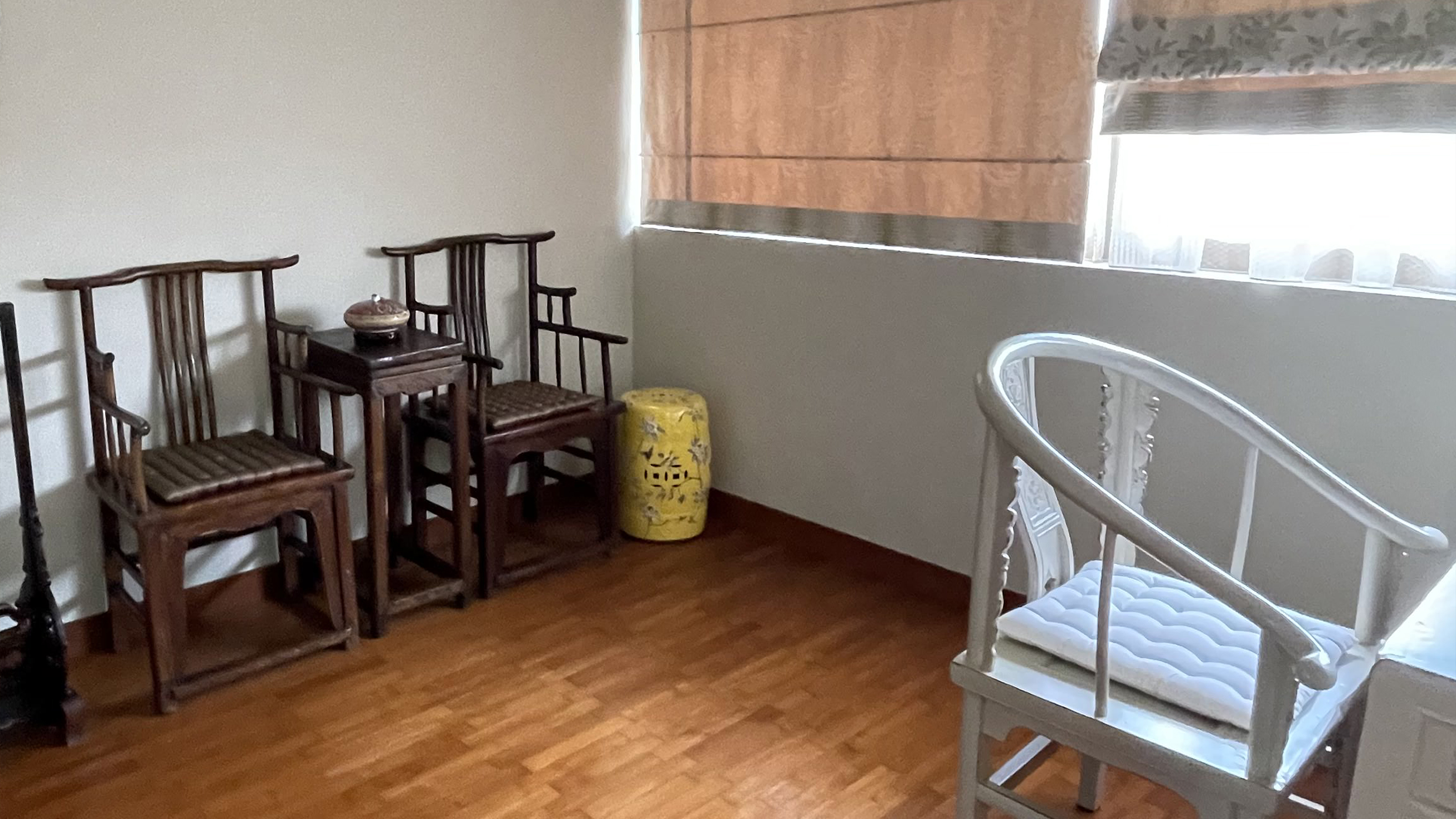
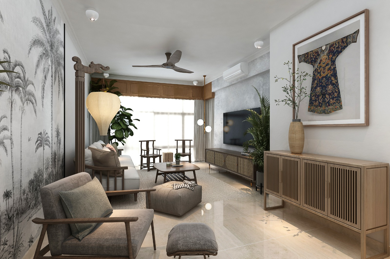
Homeowner reached out to me for a discussion at The Shelford condominium. She shared about her furnitures and decoratives historical origins. Mostly dated back to the old China dynasty, the homeowner’s husband is a collector. He has antiques; ie emperor’s robe, old chinese cabinets and old wall lamps.
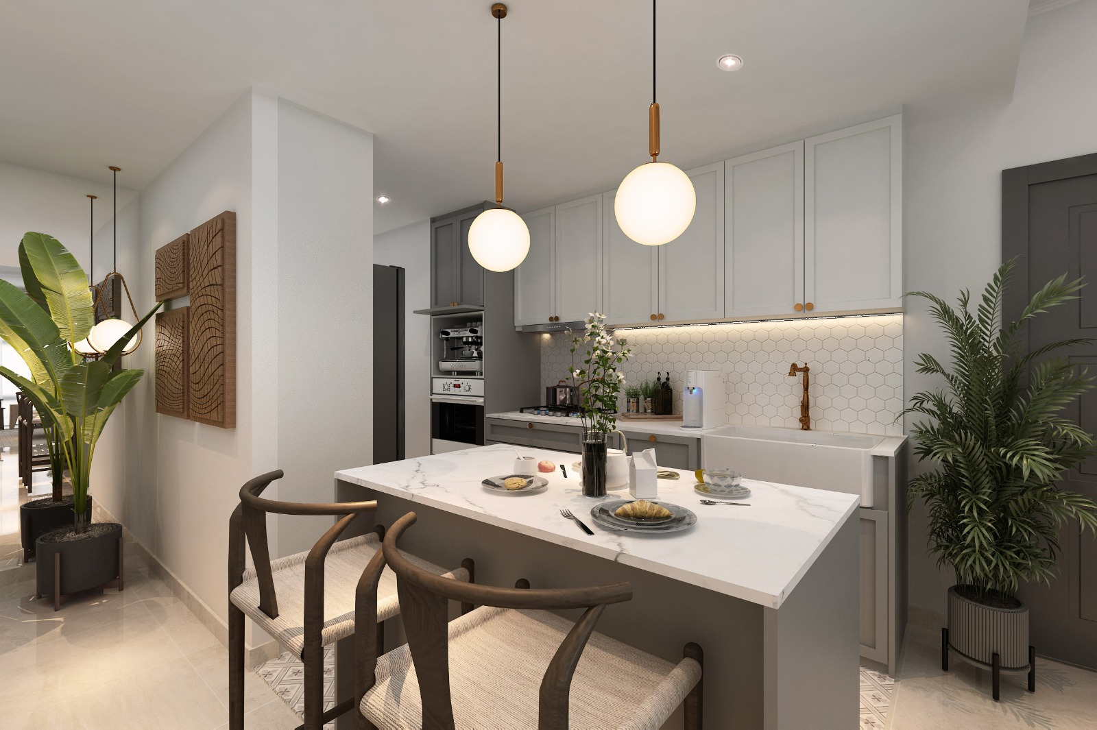
The homeowner decided to “live better”, to steer away from the old designs, she wanted to declutter the home and modernise certain aspects of the home. We planned to include more of western’s stylings to diffuse the heavy oriental ornaments. She added that she loves the idea of a tropical look, giving sort of a character to the home. She mentioned that she doesn’t have “green fingers” but she likes the naturalistic look of it.


Moving forward, we made selection from Hafary tiles. We chose a large tile feature based a tropical look; I was so intrigued by the looks and felt that we certainly made a right decision. We accompanied that feature tile with grey concrete look so that the bathroom doesn’t look too busy. Here’s how it turned out!
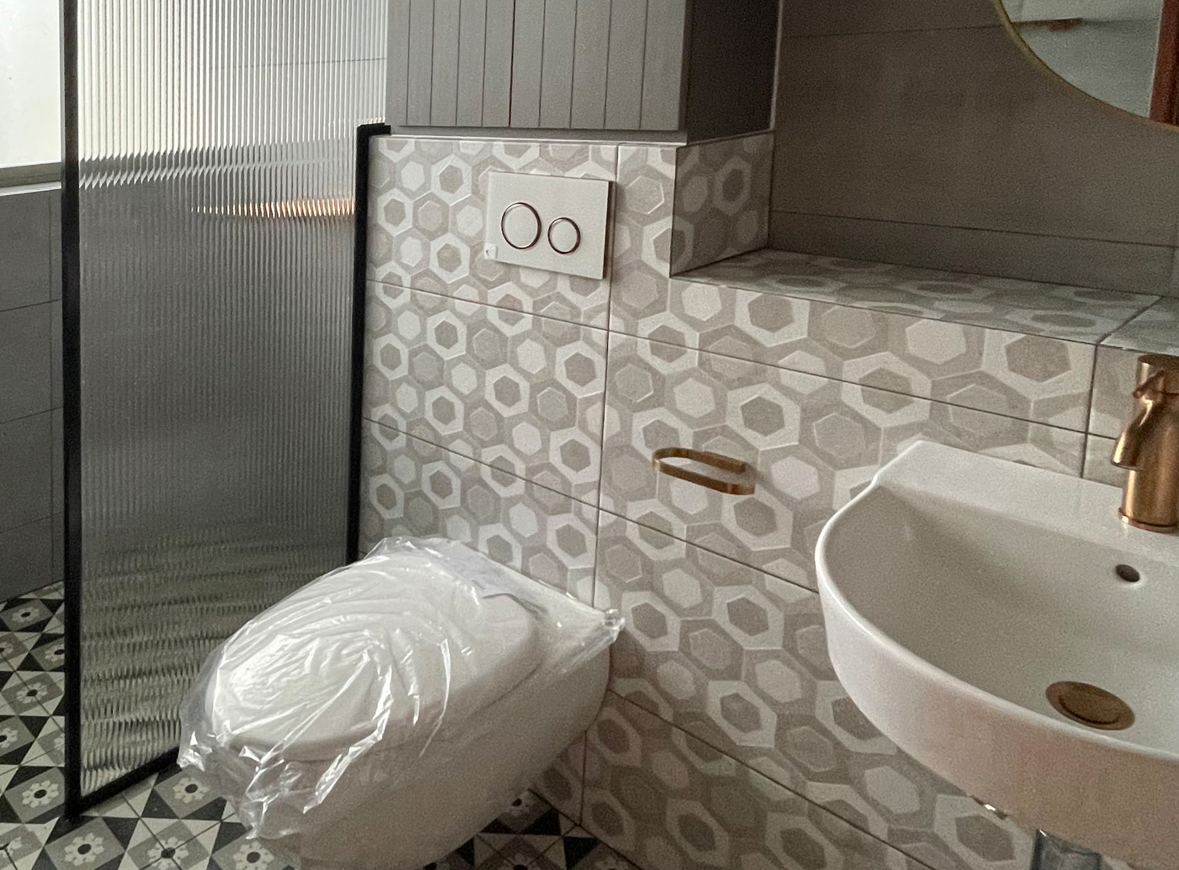
However, homeowner backed out with the initial plan. It was decided to move into a heavy graphical look. The selection steered away from the tropical idea and dived into heavy repetitions. The tiles selected mostly are pattern tiles, feels almost like a turkish bathouse. Note that there are other designs principles that we can play on; Symmetry, contrast, negative spaces are examples we can work on. Relying too much on repetition will produce a heavy graphical look. It’s feels like being in a mirror house and it tires the eye over time.
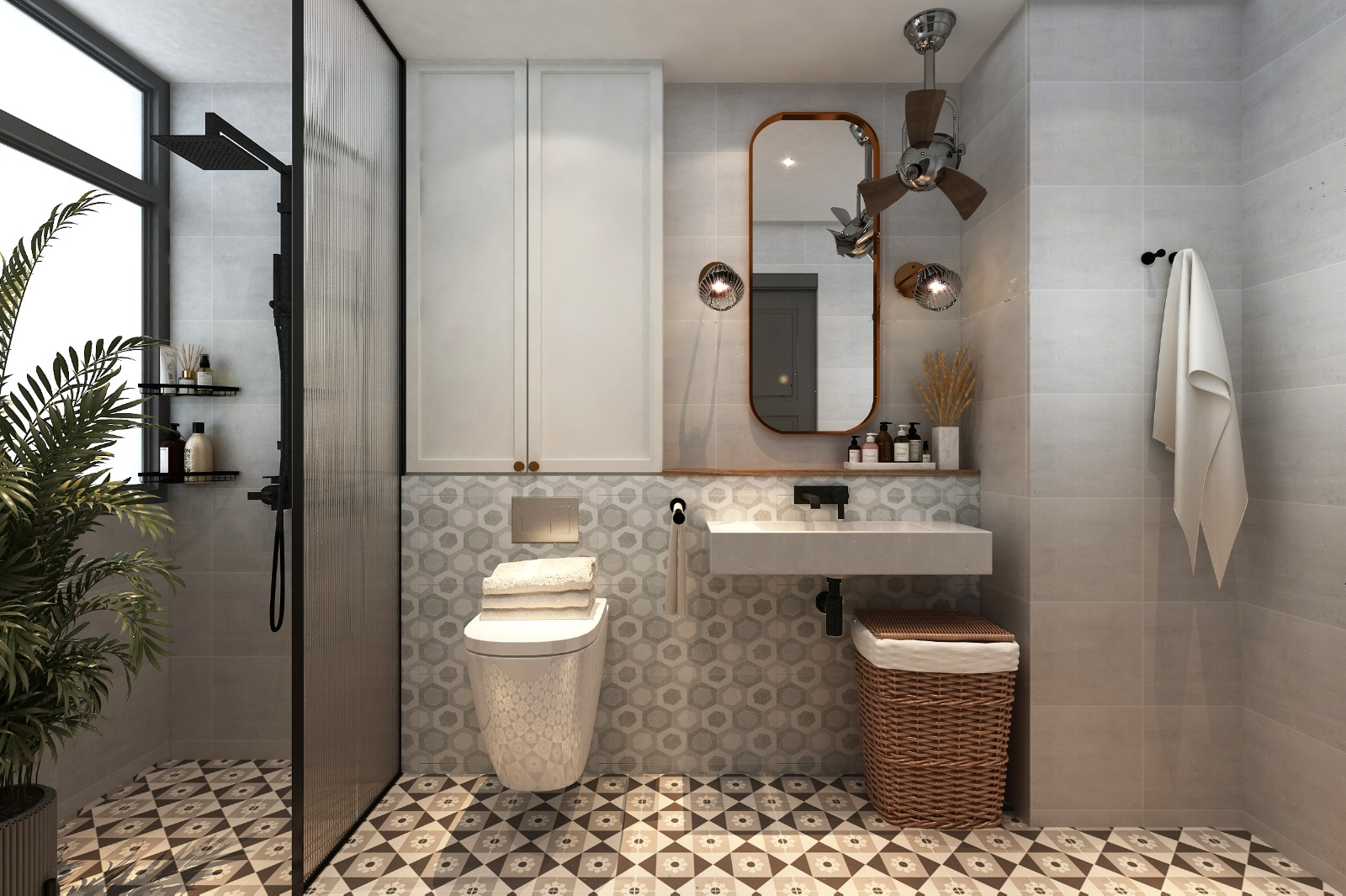
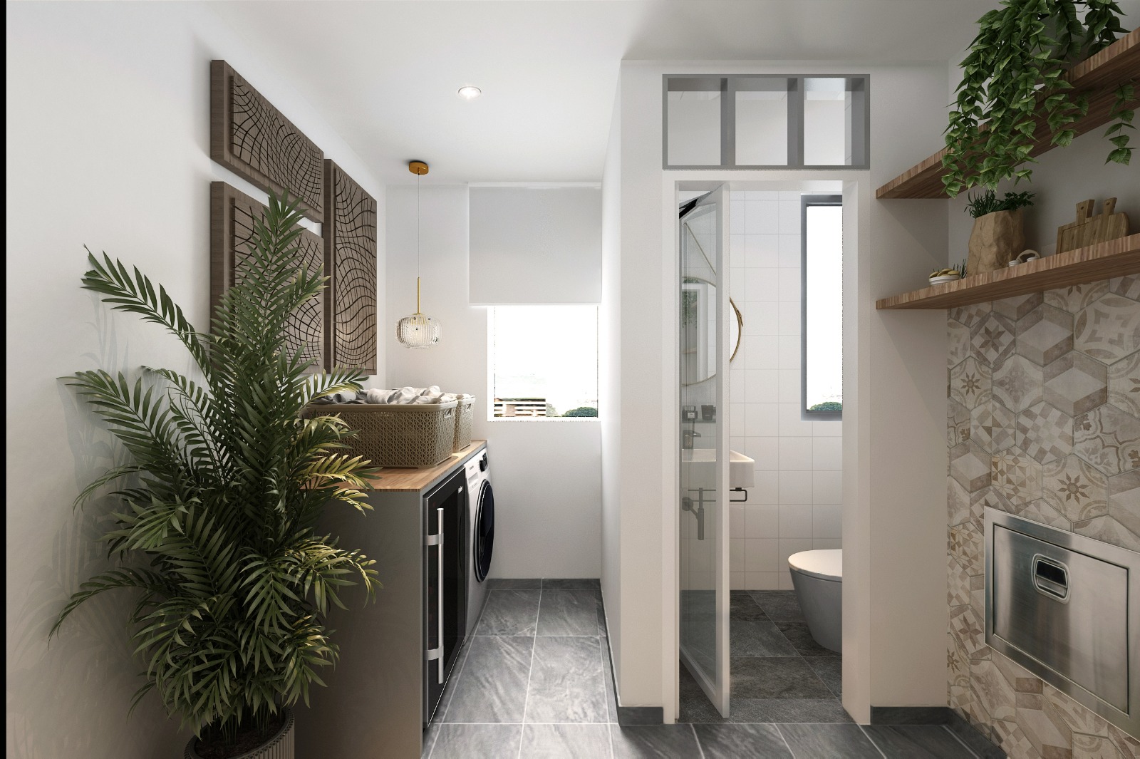
The repeated tiles misleads your visioon its focal point isn’t strong. With repetitions, decorative elements, the space will look cluttered and tight. Maximalist might be an outcome, however I feel it might contridict the owner’s direction. As IDs we could only persuade our, ultimately it is still to the homeonwer’s likings, to their decisions.
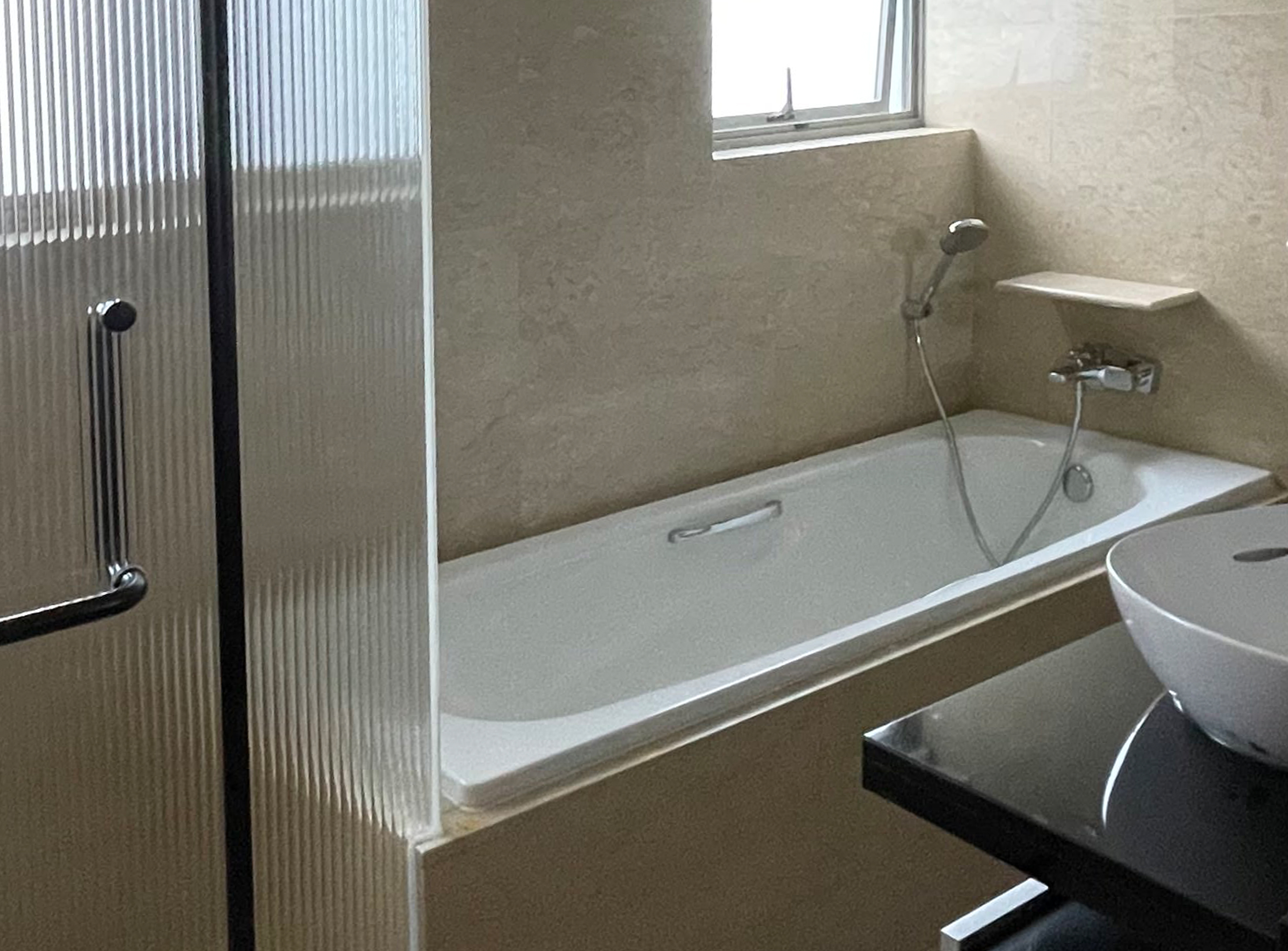

Looking back at the old pictures, I felt nothing much has changed for the design. It only feels new because there are new furnitures and fittings installed. The home still feels cluttered. Small spaces such as the yard now feels even smaller with the new tabletop protruding outwards. I hope I’m able to reccommend homeowners better in future. Minimal materials selection doesn’t mean weak design. A design concept has to be intentional, less is always more.

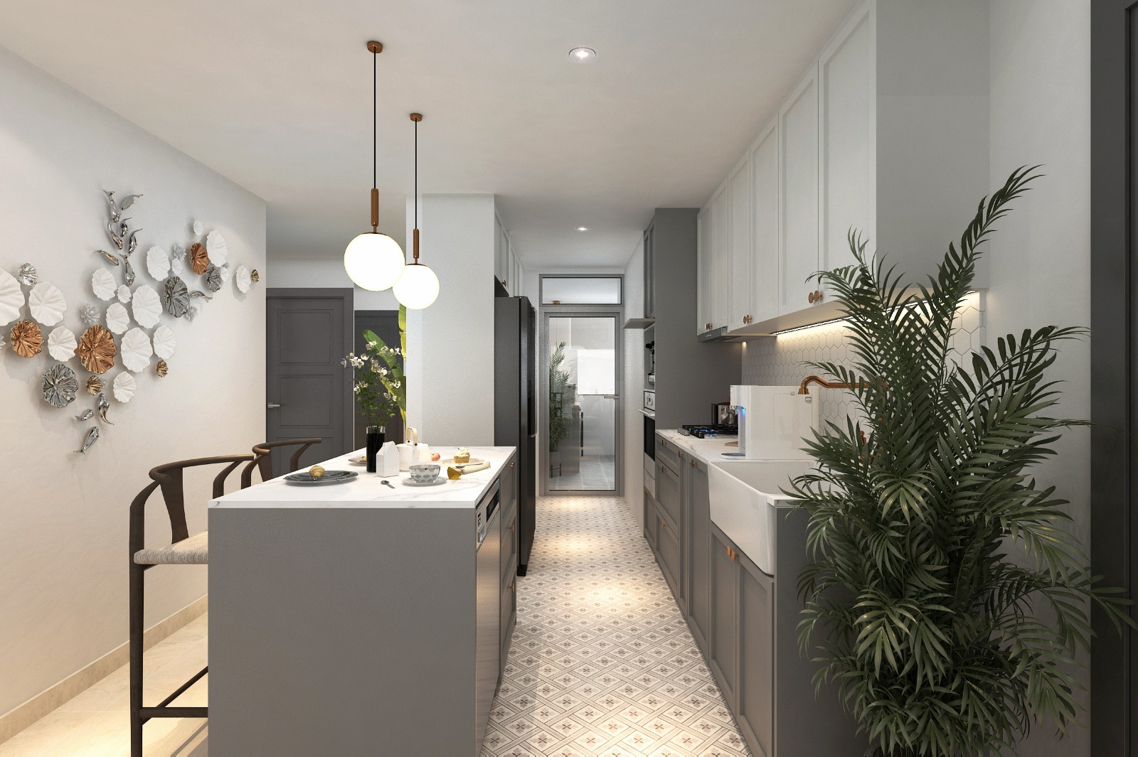
My most enjoyable part of this project will be the vinyl decal. We found a supplier who does mural decal on glass. The decal was printed and cut out based on my design. So we had this tropical leaves in bronze color. Not only the mirror was used as a reflection, the decal acts like a backdrop to the area. As we installed a downlight right above the decal, it projects shadows to the surrounding walls. Being in a tightly knitted space, that walkway corridor feels like an immersive walkthrough. Somewhat like you experience from retail interiors.
At that moment I was like “woah.. I could actualy do this..” I hope I’ll be given more opportunities to experiment on this. Definitely it is a money well spent.